CSS: in-depth tutorial on text and typography
This tutorial covers several topics related to text handling and typography with CSS. It's basically a summary of various thoughts and reflections I've made during the last years.
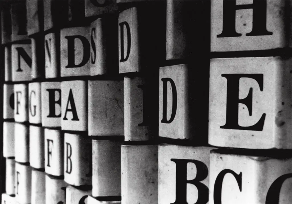
Typography
CSS typography has always been misused or misunderstood in some way. It's not about text properties or accessibility only, but also about design and beauty. It's time to try to get back the pure visual effects of a good typography. So here are five simple tips for a better CSS typography.
Use letter-spacing
You can use the letter-spacing property both to increase the legibility of your headings and to properly justify text. Examples:
Headings
h2 {
	font: normal 1.5em Georgia, serif;
	letter-spacing: 0.1em;
}
Text justification
p {
	text-align: justify;
	letter-spacing: 0.1em;
}
Using a value expressed in em augments scalability and flexibility.
Use web fonts
You can either choose to use Google Web Fonts or a font embedded with @font-face. If the latter is the case, then you should read the following article.
Use negative text indentation
The text-indent property indents the very first line of a block. You can use it with a negative value on headings to create the effect of hanging text:
h2 {
	font: normal 1.5em Georgia, serif;
	letter-spacing: 0.1em;
	text-indent: -1em;
}
Use text shadows
The CSS3 text-shadow property accepts four values: two offset points, a blur and a color value. You can use this property to create shadows on text:
h2 {
	font: normal 1.5em Georgia, serif;
	letter-spacing: 0.1em;
	text-indent: -1em;
	text-shadow: 3px 3px 3px rgba(240, 240, 240, 0.7);
}
Use rotations
You can use the CSS3 transform property to create special effects on text. Now this property is available through vendor prefixes, but you can use it to create the effect of vertical text:
h2 {
	-webkit-transform: rotate(-90deg);
	-moz-transform: rotate(-90deg);
	-o-transform: rotate(-90deg);
	filter:progid:DXImageTransform.Microsoft.BasicImage(rotation=3);
	transform: rotate(-90deg);
}
Headings and web fonts
Web fonts can be used with CSS on any textual content of a web page, but I think that they make the difference mainly on headings. This is due to an accessibility reason: if you use a web font on a large section of text, you may actually annoy users with sight problems, not to mention users with cognitive disabilities who can be easily distracted by your design choices. Instead, headings are generally shorter and for that reason they're just perfect to test some fancy web fonts to create interesting typographical effects. In this post we'll use Google Web Fonts, because they're easy to use and do not affect too much the overall performance of your web pages.
Including a web font
Google Web Fonts can be easily included in your pages through the link element, just as any other style sheet:
<head>
<link href='http://fonts.googleapis.com/css?family=Six+Caps&v1' rel='stylesheet' type='text/css' />
<link href='http://fonts.googleapis.com/css?family=Limelight&v1' rel='stylesheet' type='text/css' />
<link href='http://fonts.googleapis.com/css?family=Droid+Serif:regular,italic,bold,bolditalic&v1' rel='stylesheet' type='text/css' />
<link href='http://fonts.googleapis.com/css?family=Lobster&v1' rel='stylesheet' type='text/css' />
</head>
Here we're using four web fonts, namely Six Caps, Limelight, Droid Serif (with all of its variants) and Lobster. Google explains in full details how to use its fonts in each description page of the font you want to use. Bear in mind that your web fonts includes must come before the main styles (or style sheets) of your pages or they won't work.
Using a web font
Once included your web fonts, you have only to write a simple CSS rule using the font-related CSS properties:
h2.six-caps {
 font: 5em 'Six Caps', sans-serif;
 margin: 0;
 color: #323232;
 text-transform: capitalize;
 letter-spacing: 0.1em;
}

h2.limelight {
 font: 2.5em 'Limelight', sans-serif;
 margin: 0;
 color: #d40;
}

h2.droid-serif {
 font: italic 3em 'Droid Serif', serif;
 color: #666;
 margin: 0;
}

h2.lobster {
 font: 3em 'Lobster', cursive;
 color: #004bb2;
 margin: 0;
}
Only remember that if your font doesn't feature all the font variants (italic, bold, etc.), properties such
as font-style and font-weight will not work because of the lack of such variants in the font definition.
Inserting special Unicode characters
CSS generated content allows authors to insert special characters using the Unicode notation and an escape sequence.
Such characters must be placed as values of the content property. The first thing you should bear in mind is that not
all Unicode characters are currently supported by web browsers. Unicode encompasses more than 65,000 characters, including letters of
ancient alphabets and graphic icons. If you want to test your browser's support to Unicode characters, visit
www.alanwood.net/unicode/. When a browser doesn't support a specific character,
it replaces the missing character with a default glyph (usually a square).
CSS specifications say:
Third, backslash escapes allow authors to refer to characters they cannot easily put in a document. In this case, the backslash is followed by at most six hexadecimal digits (0..9A..F), which stand for the ISO 10646 ([ISO10646]) character with that number, which must not be zero. (It is undefined in CSS 2.1 what happens if a style sheet does contain a character with Unicode codepoint zero.) If a character in the range [0-9a-fA-F] follows the hexadecimal number, the end of the number needs to be made clear. There are two ways to do that:
- with a space (or other white space character): "\26 B" ("&B"). In this case, user agents should treat a "CR/LF" pair (U+000D/U+000A) as a single white space character.
- by providing exactly 6 hexadecimal digits: "00026B" ("&B") In fact, these two methods may be combined. Only one white space character is ignored after a hexadecimal escape. Note that this means that a "real" space after the escape sequence must be doubled.
If the number is outside the range allowed by Unicode (e.g., "\110000" is above the maximum 10FFFF allowed in current Unicode), the UA may replace the escape with the "replacement character" (U+FFFD). If the character is to be displayed, the UA should show a visible symbol, such as a "missing character" glyph (cf. 15.2, point 5).
Note: Backslash escapes are always considered to be part of an identifier or a string (i.e., "\7B" is not punctuation, even though "{" is, and "\32" is allowed at the start of a class name, even though "2" is not). The identifier "te\st" is exactly the same identifier as "test".
Here's an example that shows you how to insert an '@' just before a specific target link:
a.twitter:before {
  content: '\040';
}
Note that in this case we've used the short version (4 digits) of the Unicode sequence. Also note how the escaped sequence must be enclosed between quotes (single or double).
Ems explained
While using CSS you stumble on ems sooner or later during the development process of a web site. Most developers often ask when and where this length unit must be used and if it's the best length to use in their CSS. Let's get it straight: this length is not the best from a browser point of view. In fact, browsers automatically convert ems to absolute units (usually pixels). But it's from the user point of view that the choice of ems can make the difference.
The length of an em usually refers to the height of the lowercase 'm' letter. This height is calculated starting from the baseline. Ems are said to be relative lengths because their value depends on the font size in use on the affected element or on its ancestor. An example:
#parent {
 font-size: 12px; /* 1em = 12px */
}

#child {
 width: 10em; /* 10em = 120px */
}
The interesting thing here happens when a user changes the font size of a page: the child element will shrink or expand its width according to the actual font size in use. So if the font size is 10px, then the box will be 100px wide. Conversely, if the font size is 16px, then the box will be 160px wide. And so on. For that reason, a layout that uses ems to specify the dimensions of its elements is said to be elastic.
However, if you let your users to change the default font size, you will probably run into a problem: if the font size in use is too large, your element dimensions will actually grow until the infamous horizontal scrollbar appears on the page. To fix this problem, you can specify minimum and maximum dimensions:
#parent {
 font-size: 12px;
}

#child {
 width: 10em;
 min-width: 120px;
 max-width: 200px;
}
Using min-width and max-width actually tells the browser one thing: don't go below or over a certain
dimension. Another interesting use case of ems is when you want to prevent text from overflowing its element container when the
height and line height of such element changes according to the font size:
#branding {
 height: 3em;
 line-height: 3em;
 text-align: center;
}
In this case, the text content of the affected element will be always vertically centered, because the height and line height are set to the same value and this value changes as the font size changes.
Ems can be combined with percentages when determining the font size of a page. Since pixels are not treated in a scalable way by Internet Explorer, which doesn't allow a user to resize text when the font size is expressed in pixels, web developers have found some font size constants that make use of percentages and ems. These constants are:
| CSS rule | Equals to | Ems |
|---|---|---|
body {font-size: 62.5%;} |
10px | 1em = 10px |
body {font-size: 76%;} |
12px | 1em = 12px |
Example:
body {
 font: 62.5% Arial, sans-serif; /* 1em = 10px */
}

#parent {
 font-size: 1.2em; /* 1em = 12px */
}

#child {
 width: 10em; /* 10em = 120px */
}
Bear in mind that the actual size varies from font family to font family. So ems using Arial are different from ems using Georgia or another serif font. Never forget this when you choose your fonts on an element.