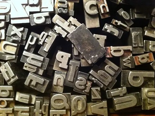
CSS: web fonts and web safe fonts: things to consider
Web fonts and web safe fonts are different only from a pure CSS point of view, but there's still an heated debate going on about the best choice for our websites. Should we use web fonts or web safe fonts? Let's try to answer to this question.
Performance
When it comes to performance, web fonts are not the ideal choice. Although many web browsers cache web fonts when retrieving a web page after the initial loading, it's difficult to say what's the actual time span of this web fonts caching.
Surely most of you know the acronym FOUF (Flash Of Unstyled Fonts). This little glitch in the rendering of a web page occurs at the very first loading of the document. Depending on the browser you're using, you might see your text with the default font family (serif, sans-serif etc.) or without any visible characters.
This happens because browsers have to parse the @font-face rule and download the linked font. If you see your document online on a mobile device, you'll probably notice the different performance when your page uses web fonts or not.
Mobile devices don't suffer from bandwidth limits only when they're connected to a WI-FI network. On iPad, for example, you're often prompted to connect to a local WI-FI network when your OS detects one near you.
On the contrary, when a mobile device uses a cellular network, there are several limits and fluctuations in the band availability. Most mobile users often pay a fee if they exceed their download quota. Forcing users to download several kilobytes of fonts may not be a recommended approach in these situations.
Design
Design is the main use-case for web fonts. In fact, fonts such as Museo Slab, Proxima Nova, Chunk Five, Zurich and many others are often chosen because they actually add an extra level of finesse to the global design of a page.
On the other hand, there are many designers who think that web safe fonts are just fine for their needs. Take for example two famous sites, Smashing Magazine and Nettuts+. The former uses web fonts such as Skolar and Proxima Nova, while the latter simply relies on the traditional Helvetica/Arial font.
And the winner is.. both! In other words, when it comes to design, it's always a matter of taste and, as old good Romans said, De gustibus disputandum non est (In matters of taste, there can be no disputes).
Conclusions
Web safe fonts and web fonts are perfectly balanced when we need to choose between them. If you're obsessed with performance, then you may rely on web safe fonts. Instead, if your primary goal is design, then you may choose web fonts.
As you can see, the choice is entirely up to you.